
Identity
Recognised before your name is read.
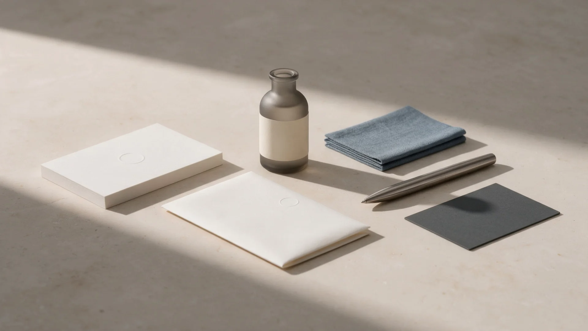
We design the mark, colour, type and the rules that hold them together, so your business looks the same on the card, the packaging, the sign and the screen.
Tell us about yoursA mark is constructed, not drawn.
When every curve comes from geometry, the mark holds at any size and anyone can rebuild it exactly. Watch it being set up, one step at a time.
- 01Circle
- 02Axis
- 03Neck
- 04Mark
- 05Logotype
- 06Rules
Circle. The body of the vessel is a circle, like the potter's wheel. Its radius becomes the unit everything else is measured in.
One set of rules. The same face everywhere.
Change the lead colour, show the rules, make the mark larger or smaller. The website, the sign, the card, the label and the avatar change together, because they follow the same rules rather than separate decisions.
The rule: one lead colour per application. Everything else is paper and ink.
Ceramics for tables that welcome people.
Handmade tableware for homes, restaurants and hotels.
Request the catalogue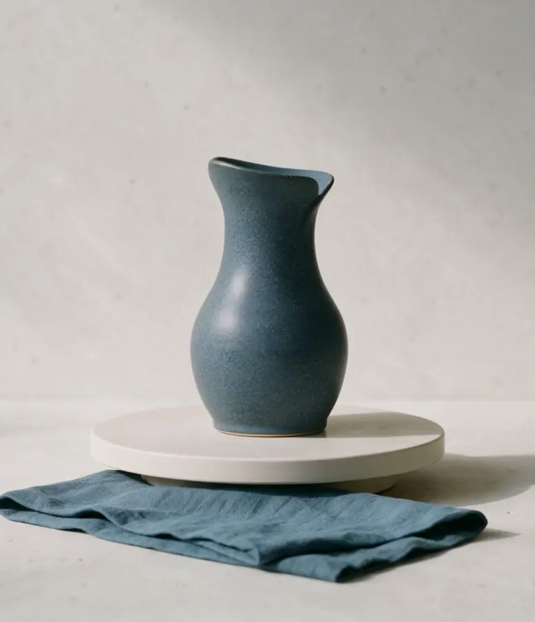
The name joins once it has room to be read comfortably.
A Noria study. Illustrative details.
Colours from the island. Type for two alphabets.
The workshop's colours come from Thira: pumice, volcanic stone, the water of the caldera, fired clay. We test them the way a potter tests glazes, on tiles, before they go anywhere.
- HEX
- #EBE8E0
- RGB
- 235 232 224
- CMYK
- 0 1 5 8
- HEX
- #2B2A27
- RGB
- 43 42 39
- CMYK
- 0 2 9 83
- HEX
- #3E5664
- RGB
- 62 86 100
- CMYK
- 38 14 0 61
- HEX
- #9A5B44
- RGB
- 154 91 68
- CMYK
- 0 41 56 40
How much each is used
Every piece is thrown on the wheel once.
Headlines
A classic serif in italic. The workshop's voice, in few words.
Αα Ββ Γγ Δδ Εε Ζζ Ηη Θθ Ιι Κκ Λλ Μμ Νν Ξξ Οο Ππ Ρρ Σσς Ττ Υυ Φφ Χχ Ψψ Ωω
Text
Geologica. For information, catalogues and screens, in Greek and Latin.
Αα Ββ Γγ Δδ Εε Ζζ Ηη Θθ Ιι Κκ Λλ Μμ Νν Ξξ Οο Ππ Ρρ Σσς Ττ Υυ Φφ Χχ Ψψ Ωω
- Headline44 / 48Vase 06, matte white
- Subhead27 / 34Clay from Thira, fired at 1,240 degrees
- Text17 / 27Each series comes out twelve pieces at a time. No two sit the same way.
- Label13 / 18Hand wash only
A Noria study. Colour values are for screen and four-colour print.
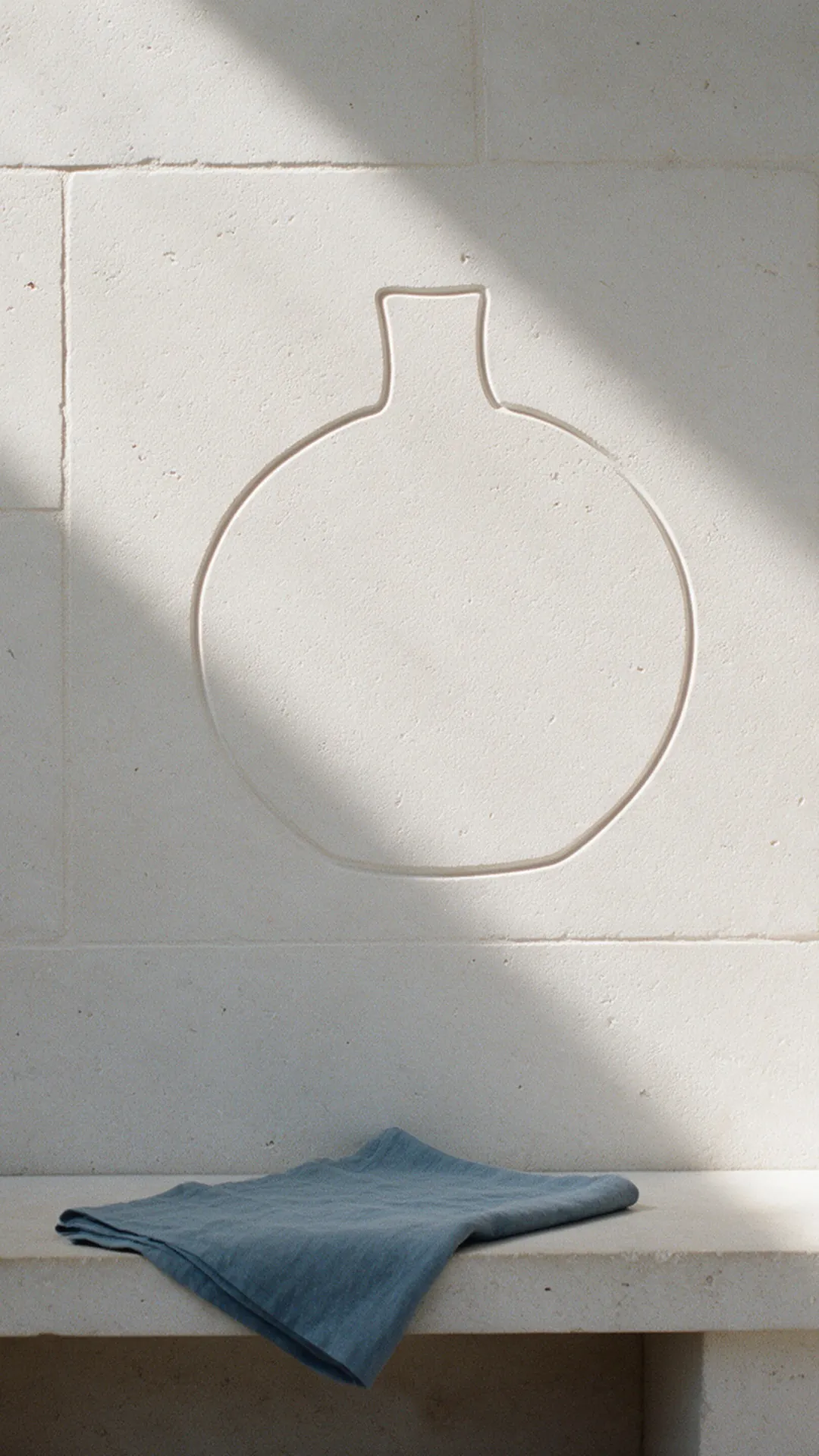
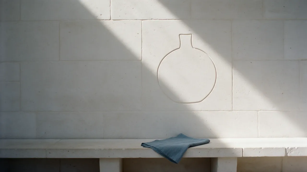
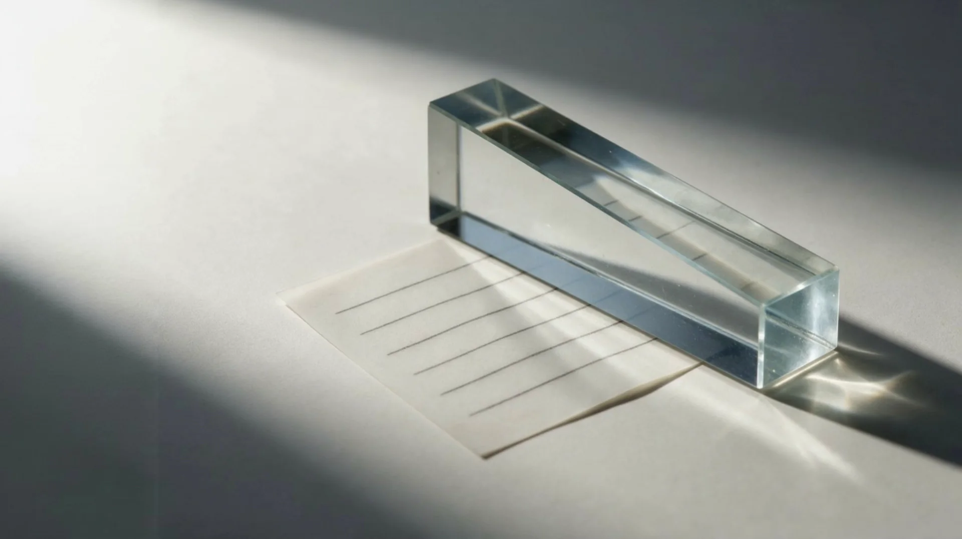
The same mark, in every light.
An identity does not change with the hour. It is drawn once, with geometry and rules, and it holds on stone, on paper and on screen.
The outline of a vase carved into a limestone wall, with light passing across it.
What we deliver

Mark and logotype
Built from geometry, in versions for every size, from the icon to the façade.
Colour
A small palette with roles and proportions, with values for screen, print and paint.
Typography
Typefaces that set Greek and Latin properly, with a scale for every use.
Applications
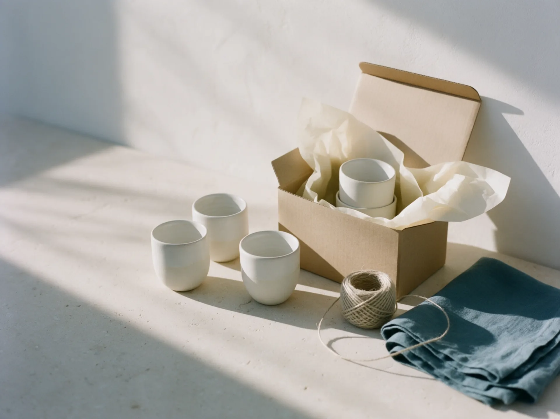
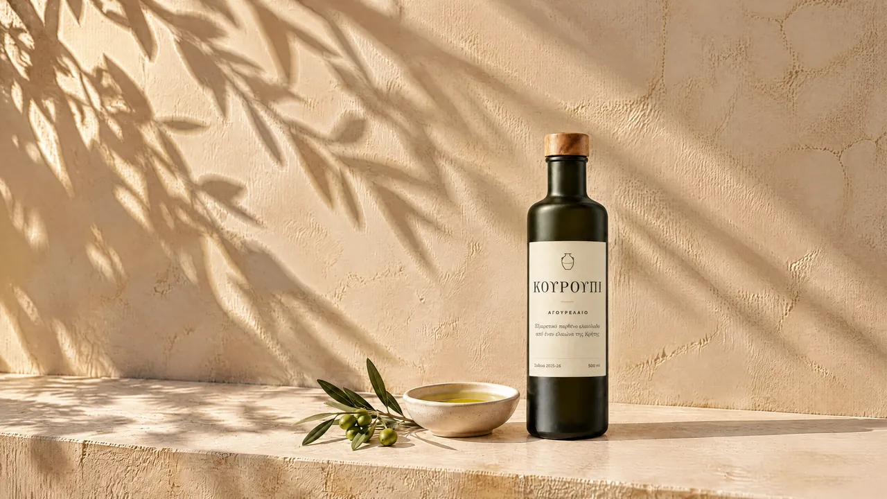
Cards, labels, packaging, signage and digital templates, ready for production.
Identity guidelines
The rules in one document that the printer and the next designer both understand.
Organised files
Vector, screen and print files, in folders with names that make sense.
From the first talk to the guidelines.
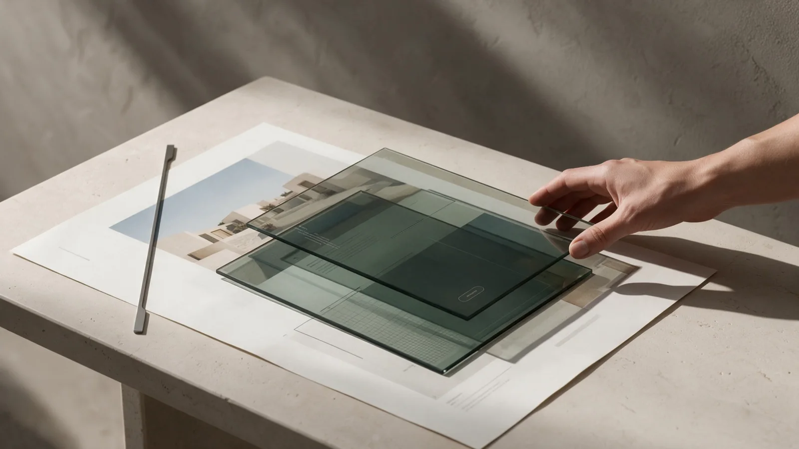
You see every direction on real applications, not on a white background, so you decide on what will actually live in the world.
- 01
Getting to know you
What you do, for whom, and what people should think when they see your name. We look at what already exists.
- 02
Directions
Two or three clear proposals, tested on a card, a screen and packaging.
- 03
System
One direction becomes a system: mark, colour, type, versions and rules.
- 04
Applications
We design what will be printed or shown, and check test prints.
- 05
Handover
Guidelines, files and a session with your team, so it is applied correctly without us.
Before we start.
A brand identity includes the mark and logotype in versions for every size, a small colour palette, typography that sets Greek and Latin properly, and a guide with the rules. Depending on the business, we also design its applications: cards, labels, packaging, signage and digital templates. At the end we hand over organised files for screen and print.
Usually six to twelve weeks, depending on how many applications you need and how quickly decisions are made. We agree the timeline in writing at the start.
Not necessarily: a logo people already recognise often needs only cleaning up, versions for every size, from the icon to the façade, and rules for colour and type. We start from what exists and tell you honestly whether it is worth keeping, before we propose a new mark.
By the scope: a mark and basic rules, or a full system with packaging and signage. After a short conversation we send a proposal with cost, deliverables and timings.
A meeting with the people who decide, whatever material already exists, and an honest opinion at every stage. The earlier we hear a no, the better the result.
The identity grows with you: new packaging, a new shop, a new series. We can keep designing applications, or show whoever makes them how to use the rules.
Goes well with
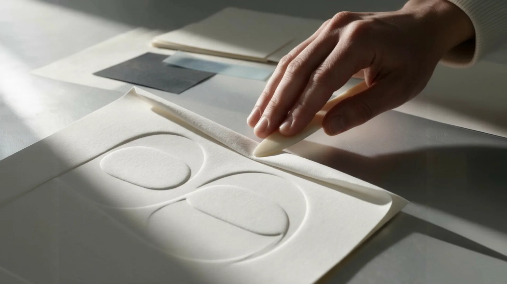 Content & photographyPhotography, copy and posts in one voice.
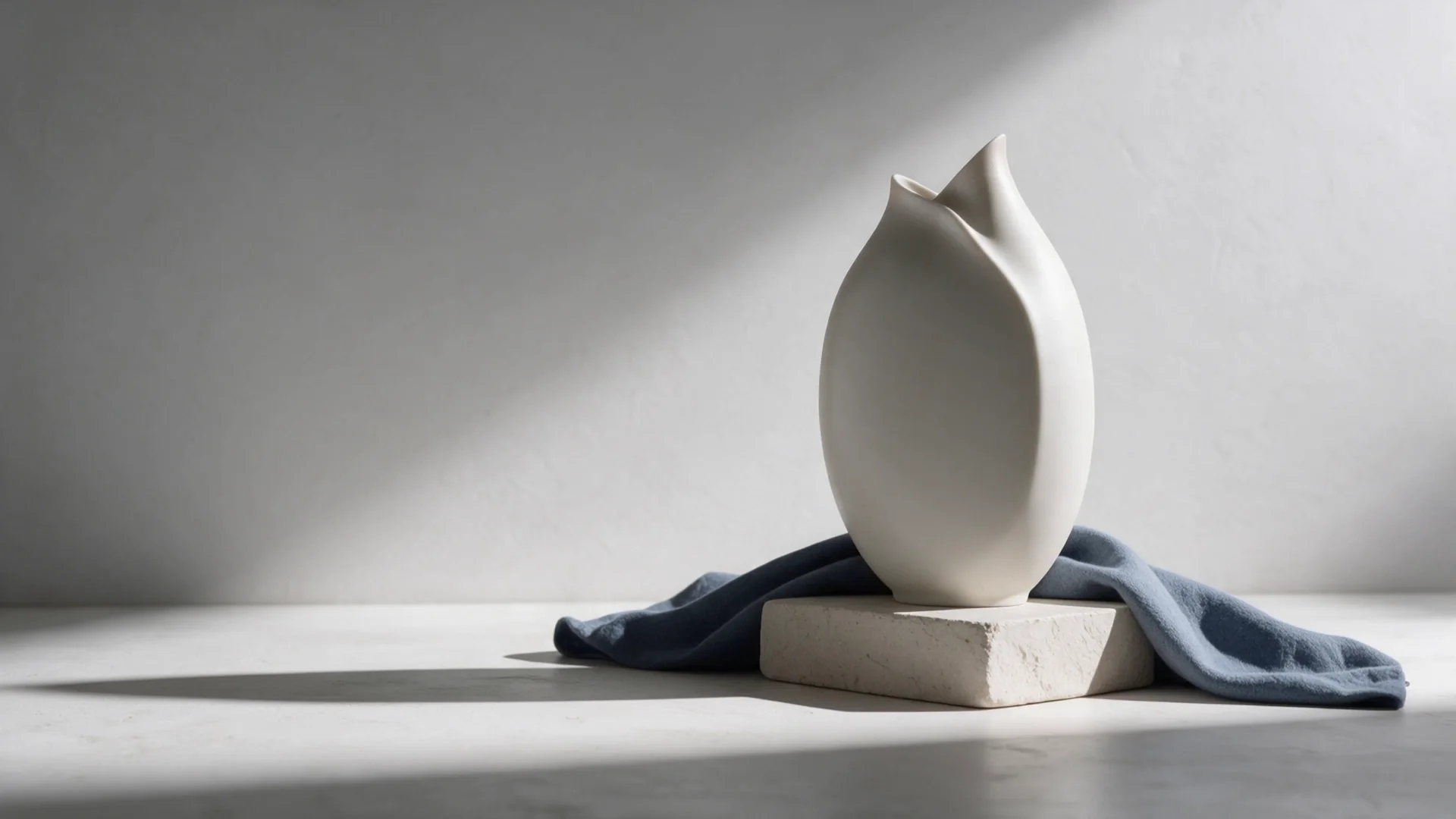 3D & ARThe product from every side, and in the client’s own space.
 AdvertisingThe right offer, to the right people, measured.
For which industries